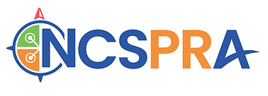
NCSPRA - Logo Design
Graphic Designer: Logo Design
The mission of the North Carolina School Public Relations Association (NCSPRA) is to build support for public education through well-planned and responsible public relations.
NCSPRA is an Exemplary Chapter of the National School Public Relations Association (NSPRA). We have been honored with NSPRA's prestigious Mark of Distinction Award four consecutive years for delivering outstanding professional development to our members and to school PR professionals throughout the country.
Through our nationally recognized podcast, award-winning professional development, and unparalleled support network, we are proud are support our members in the important work they do. We welcome you to join our NCSPRA family and gain the benefits of membership as we work together to support North Carolina's public school students and educators.

01
A Fresh Look for a Trusted Voice
NCSPRA was ready for a transformation. Their former logo no longer reflected the organization’s purpose or energy. In reimagining their visual identity, they sought:
-
A fresh, modern color palette
-
Contemporary typography
-
A design that evokes trust, reliability, and forward momentum
02
Competitive Landscape & Regional Identity
To ground the design in a strong sense of place, we began by analyzing logos from School Public Relations associations across the country. A logo board helped us identify regional distinctions, with SUNSPRA and TSPRA standing out for how clearly they reflected their geographic identities. This informed our initial direction—focusing on what makes North Carolina visually and culturally unique.


03
Early Concept Development
Initial sketches and concepts centered around North Carolina’s identity, incorporating elements from the state’s geography, flag, and iconic coastal features. Lighthouses—prominent symbols in the region—served as early visual anchors, emphasizing guidance and place-based connection.
04
Conceptual Pivot: From Place to Purpose
After exploring geographically inspired concepts, we chose to pivot toward a more abstract visual direction. A new logo board was assembled, centered around themes of support, guidance, and connection. Inspiration came from symbolic elements—a compass, a life preserver, an extended hand, networking—each representing trust, friendship, and the steady, reliable presence NCSPRA provides to its community.

05


Refining the Visual Language
This round of exploration brought us significantly closer to a direction that aligned with NCSPRA’s values and vision. We selected Poppins, a modern geometric sans-serif typeface, for its clean structure, high readability, and approachable tone—qualities that reflect the organization's professionalism and accessibility.
We also introduced a refreshed color palette, expanding beyond the traditional red, blue, and gold of the North Carolina state flag to include bright, vivid hues that felt more dynamic and forward-looking.
Conceptually, we focused on the compass as the central visual metaphor—symbolizing guidance and direction—while experimenting with secondary elements such as helping hands and networking symbols to reinforce themes of support, collaboration, and connection.
02
Final Logo System
The final identity system includes three logo variations, designed for flexibility across digital and print applications:
-
Monogram Mark: A compact version featuring a compass and subtle networking icons surrounding the letters NC, representing North Carolina. This variation serves as a strong standalone icon and is currently used as the organization’s favicon.
-
Icon with Acronym: The full acronym NCSPRA, with a visual emphasis on the “PR” in a distinct color to highlight the organization’s core focus—Public Relations. Ideal for medium-scale applications where clarity and brand recognition are key.
-
Icon, Acronym and Full Name: A complete version including the organization’s full name, offering maximum clarity and formality. This version is best suited for large-scale formats such as banners, presentations, or printed collateral.
Together, these variations create a cohesive yet adaptable brand system that communicates both professionalism and approachability.


