Mr. Bigsby's Bubble Gum Adventure
Author, Designer and Illustrator: Children's Book
This children’s book invites young readers ages 3 to 6 on a delightful journey around the world — all through the eyes of a little boy’s adventurous cat! When the curious kitty flies out the window and begins exploring faraway places,.
Designed to spark curiosity about geography, this story introduces young minds to famous landmarks, diverse environments, and new parts of the world, The illustrations bring each destination to life, encouraging children to point, ask questions, and imagine the world beyond their own backyard.
Blending playful storytelling with educational value, this book is a visual adventure that inspires exploration, learning, and a love of travel in even the youngest explorers.

01
Character Concept Art
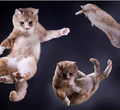
The first step in bringing this story to life was developing its two main characters — a curious little boy named Billy and his clever, globe-trotting cat, Mr. Bigsby. I began by creating concept art to explore their personalities, expressions, and visual style.

02
Reference Material
Reference materials played a key role in shaping the visual identity of both Billy and Mr. Bigsby. To ensure the characters felt authentic and relatable to young readers, I studied a variety of sources.
These materials helped ground the character concepts in reality while still allowing room for imaginative flair, ensuring both Billy and Mr. Bigsby would be visually engaging and emotionally resonant for young audiences.


03

Character Sketches
As the story developed, creating additional character sketches became essential for building dynamic characterization,
These dynamic sketches also guided the pacing and composition of each scene, helping me visually communicate movement, mood — all of which are critical in telling the story through pictures as much as through words.
04
Storyboards
To bring structure and flow to the story, I used storyboards as a key part of the visual development process. Storyboarding allowed me to map out the narrative visually, page by page, helping to establish the pacing, scene transitions, and overall rhythm of the book. This step was especially important for a young audience, where clarity, visual engagement, and page-to-page momentum are essential to keeping attention and supporting comprehension.
Through the storyboard process, I sketched out rough compositions for each spread — positioning characters, major landmarks, and key visual elements to ensure a balance of action, emotion, and scenic variety. These early layouts helped determine where moments of excitement, calm, or curiosity would land, and ensured that each illustration moved the story forward while reinforcing the geographic learning and emotional journey of the characters.
The storyboards also served as a visual script for the book, allowing me to test how text and imagery would interact. I could quickly identify whether a scene needed more detail, stronger visual storytelling, or a clearer expression of character movement. This iterative process allowed for early problem-solving before final illustrations began, saving time and ensuring the final artwork would be cohesive, engaging, and easy to follow for children ages 3–6.


05
Page Layout Design
A major inspiration for the page layout of this book came from "In the Night Kitchen" by Maurice Sendak. Sendak’s ability to break traditional picture book boundaries—allowing characters to move fluidly across panels, full-page spreads, and even out of traditional frames—inspired me to think more playfully and cinematically about visual storytelling.
Rather than confining the narrative to static, symmetrical pages, I explored layouts that reflected movement and imagination, much like Sendak’s dreamlike sequences. For example, just as In the Night Kitchen uses sequential art elements and comic-strip pacing to create a sense of action and continuity, I incorporated a mix of full spreads, vignettes, and overlapping panels to mirror the adventurous and whimsical nature of Mr. Bigsby’s journey.
06
Dynamic Layouts
To guide the flow of the story and enhance the visual experience for young readers, I used grid structures as the foundation for creating dynamic page layouts. Rather than relying on a rigid or uniform grid throughout the book, I embraced a flexible approach — shifting between structured panels, asymmetric grids, and full-bleed illustrations to mirror the rhythm of the narrative and reflect the excitement of Mr. Bigsby’s global adventure.
The interplay of grid-based and freeform layouts allowed me to emphasize key moments, control pacing, and spotlight important geographic or cultural details, all while maintaining a visual structure that supports early comprehension and visual literacy.


07

Text Exploration
Throughout early drafts, I experimented with layout, size, and placement of the text in unconventional ways — letting it curve along the water of the ocean or change in scale as if floating away. These playful arrangements helped the text feel alive and integrated into the illustrations, guiding the reader’s eye and reinforcing the action or emotion of each scene. This exploration was heavily inspired by classic storybooks where typography acts as a narrative tool, not just a container for dialogue.
After extensive testing, I settled on Glouchester MT Extra Condensed for the display and character names — a tall, expressive typeface with a vintage storybook quality that adds personality and movement to the titles and headings. For the body text, I chose Klinic Slab Book at 17 pt., a friendly and highly legible slab serif that supports young readers with its clean letterforms, generous spacing, and subtle warmth. Its contemporary, grounded tone complements the imaginative illustrations without distracting from them.
08
Start to Finish
These illustrations showcase the full creative process from start to finish — beginning with initial hand-drawn page layouts and design concepts, and culminating in the final, polished full-page spreads that bring the story vividly to life.


